The color palette you choose for your home’s interior lays the foundation for everything else—your furniture, your mood, and the overall vibe. While there’s value in consistency to create a cohesive feel, there’s no one-size-fits-all rulebook when it comes to color. And even if there were… rules are meant to be broken, right?
This is your home. Your space. So choose colors that speak to you—ones that reflect your personality and feel good long-term. Neutral tones are always a safe bet. They breathe freshness into your home while staying classic through the seasons.
Here are some thoughtful tips from Homely Living to help you pick the perfect colors for your space—whether you’re going bold, staying neutral, or somewhere in between.
Consider Your Personal Style
Start with you. What colors are you naturally drawn to? A great way to find clues is by peeking into your own closet—you probably gravitate toward colors that make you feel good, look good, or spark joy. That same instinct can guide your home color choices.
Think about what tones you love in general. Soft and earthy? Moody and rich? Bright and playful? Let your personal preferences lead the way.
Pinterest is a goldmine for home décor inspiration, so don’t be afraid to dive in. Explore different interior styles and take note of which ones pull you in. Pay attention to their color palettes. What are the common threads in the spaces you love?
The key here is intention. Skip trendy shades that might feel stale after a few months. Instead, choose colors that feel true to you—ones you won’t get tired of anytime soon.
Understand the Color Theory
Color isn’t just visual—it’s emotional. The shades you choose can set the tone for how a room feels and how you feel in it.
Colors on the warm side of the spectrum (like reds, oranges, and yellows) tend to evoke coziness, energy, and vibrance. But depending on how they’re used, they can also stir up intensity or restlessness.
On the cool side (think blues, greens, and purples), you’ll find hues that often bring calm, serenity, and a sense of spaciousness. At the same time, too much coolness can sometimes feel a bit distant or cold.
That’s why understanding color theory is a game-changer. Once you know the kind of mood you want in each room, whether it’s a soothing bedroom or an energizing kitchen—you can use the color wheel to guide your choices and create a vibe that truly supports your lifestyle.
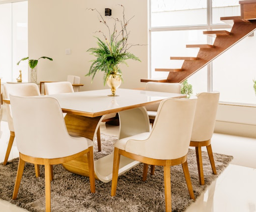
Start with Common Areas
Begin by choosing a color palette for the most visible spaces like the living room, dining room, and entryway. These areas often set the tone for the rest of your home, so they’re a great place to establish your style and build from there.
Some people prefer to keep things neutral throughout and let furniture, decor, and a few accent walls bring in color and personality. Others want their walls to do the talking. Ask yourself: Do you want the backdrop to make a statement, or would you rather let your furnishings take center stage?
Either approach can work beautifully—it just depends on the look and feel you’re going for. Once you’ve made that call, it becomes much easier to create flow from room to room.
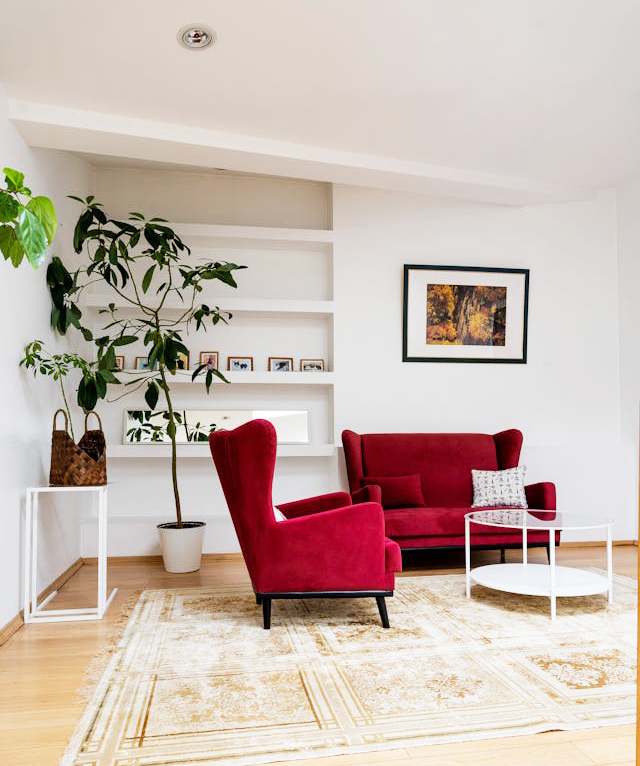
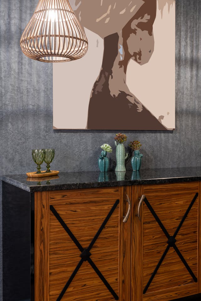
Contrast Warm and Cool Tones
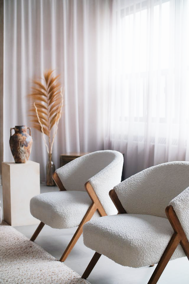
A beautifully balanced room usually blends both warm and cool tones. Too many cool shades can leave a space feeling cold or detached, while an overload of warm tones might feel a little too intense or heavy. The magic happens in the mix.
Consider soft greys with warm wood accents, or creamy neutrals paired with cooler blues or greens. Striking this balance not only adds depth to your space but also creates a cozy, visually harmonious environment that just feels right.
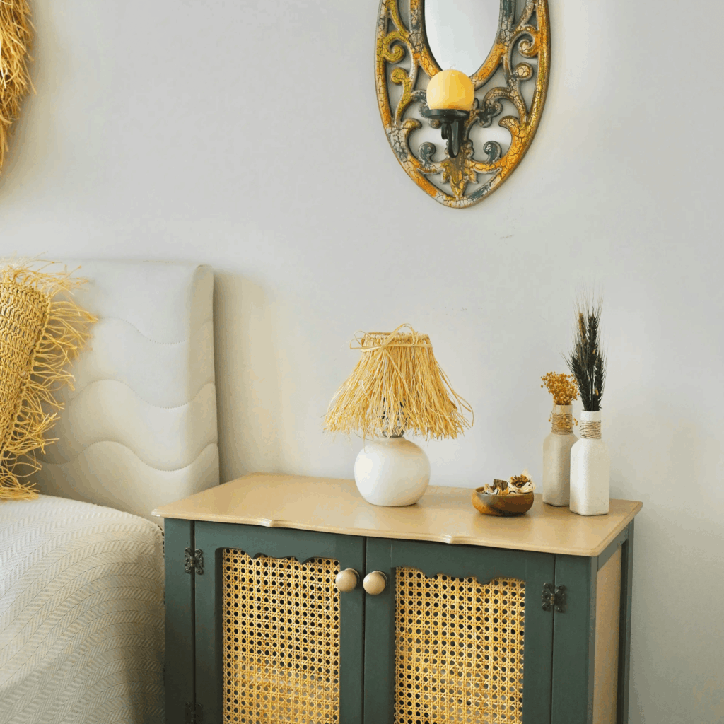
The Rule of Three
When it comes to choosing a color palette, the rule of three is a game-changer. Sticking to three main colors helps create a space that feels cohesive, balanced, and easy on the eyes. It’s a solid guideline that works across the board, whether you’re layering paint colors, patterns, or styling furniture and accessories.
Of course, you can always bend the rules, but this one’s a handy starting point if you want a polished, put-together look without overthinking every detail.
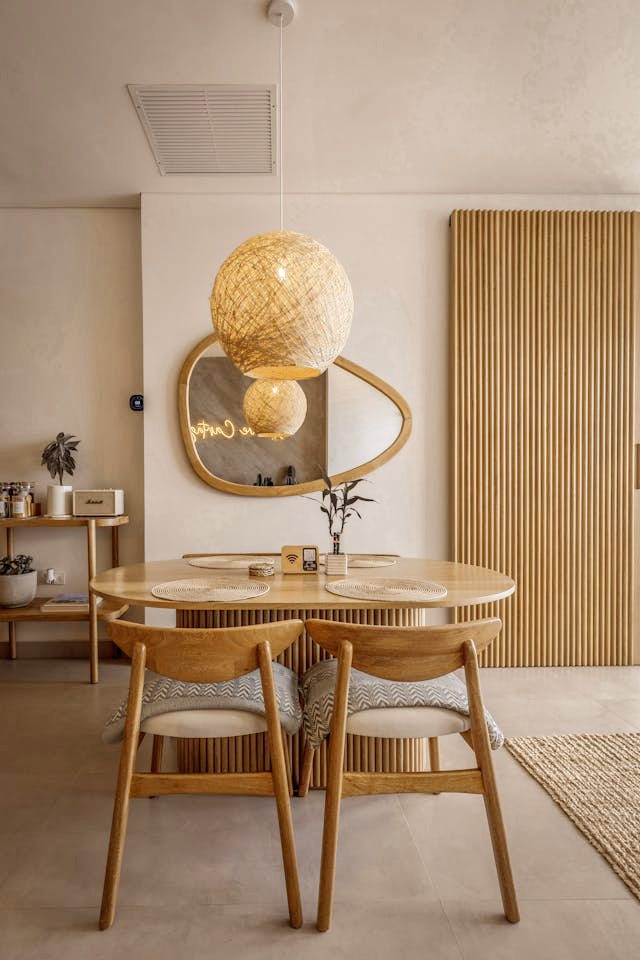
Stick with Grays
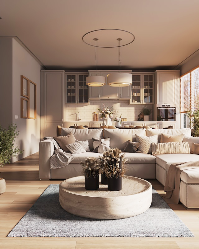
Gray is one of those timeless shades that never really goes out of style and for good reason. It’s a versatile foundation that works with just about any aesthetic, from modern minimalism to cozy traditional.
Pair gray with crisp white for a chic, monochromatic look, or use it as a subtle backdrop to let your furniture and accessories shine. Bold vases, abstract art, vintage heirlooms—gray makes everything around it pop without stealing the spotlight.
Make It Yours
Your home is your personal sanctuary it should reflect who you are, starting with the colors you choose. Think about what you want your space to say about you. Cozy and grounded? Bold and creative? Minimal but warm? Let that vision guide you.
The best color palette is the one that feels right to you. One that lifts your mood, fits your lifestyle, and works with your space. Consider your lighting—does your home get tons of natural light, or rely more on lamps and overhead fixtures? Certain colors come alive in sunlight, while others shine under soft, ambient lighting.
And above all, have fun with it. This is your space. Don’t stress the rules too much. If it feels good, you’re on the right track.
Choosing the right color for your home isn’t about following trends, it’s about creating a space that feels just right for you. Whether you lean toward soft neutrals, bold hues, or a little bit of both, the key is to pick a palette that reflects your personality and supports the way you live.
Take your time, trust your instincts, and remember: have fun with it. This is your space. Don’t stress the rules too much. If it feels good, you’re on the right track. You’re not just decorating, you’re creating a space that feels like home.
Let’s make home your favorite place to be.